What the Parish Noticeboard Knows That the Studio Forgets
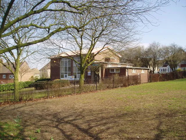
Photo: Dr Neil Clifton, CC BY-SA 2.0, via Wikimedia Commons
On a wet Tuesday in a south London church hall, the noticeboard by the door is doing several jobs at once. It is announcing a jumble sale, advertising a yoga class, warning about a road closure and asking for volunteers to stack chairs. The paper is a mixture of white, cream and fluorescent yellow. Some sheets are curled at the corners. One has been laminated and then written on with a dry-wipe marker. Another is a photocopy of a photocopy, the headline softened into grey.
It is not a portfolio piece. It is something more useful: a communication surface that has to work for people who are walking past in a coat, holding a bag, perhaps late for something else. The parish noticeboard is a hard test of design, and it passes more often than the polished studio equivalent.
Hierarchy is a survival skill
The first lesson is about hierarchy, though nobody involved would use that word. A well-set noticeboard does not ask the reader to admire its layout. It puts the useful thing first: the date, the time, the place and the action. The headline is large because it has to be. The detail is smaller because it can be read at close range. The telephone number is repeated at the bottom because tearing off a strip is still a practical interaction.
Studio work often reverses this order. We begin with mood, then tone, then a considered typographic system, and only later remember that someone has to find the opening times. The noticeboard begins with the glance. That is not a failure of ambition. It is a correct reading of the audience.
A good noticeboard also accepts that it is not the only thing on the wall. It shares space with overlapping events, old notices and the occasional handwritten correction. The designer who insists on perfect isolation is designing for a condition that does not exist. The useful question is not 'How do I make this stand out?' but 'How does this remain legible when it is surrounded by everything else?'
Weatherproofing is part of the brief
London is not unusually severe, but it is reliably damp. Noticeboards in halls, libraries and leisure centres deal with condensation, draughts, direct sun and the occasional leak. The laminated sheet is not an aesthetic choice. It is a durability decision. The drawing pin is not a charming vernacular detail. It is a fixing method that has to hold through a winter.
Designers and makers can borrow this attitude without becoming literal about it. Weatherproofing, in a broader sense, means designing for the conditions in which the work will actually be used. A website that is read on a phone in a busy kitchen is a different object from one that is read on a large monitor in a quiet office. A printed menu that has to survive a lunch service is not the same as a wedding invitation. The noticeboard asks a blunt question: what will happen to this thing after it leaves the studio?
That question can be applied to almost any small commission. Will the client have to update it themselves? Will it be photographed by someone with no lighting? Will it be printed on the office printer rather than the good one? A design that assumes ideal conditions is a design that has not finished thinking.
The audience is not abstract
The noticeboard also has a healthy disregard for the abstract audience. It knows that the people reading it are local, busy and likely to be looking for a specific piece of information. It does not try to speak to everyone in general. It speaks to the person who needs to know whether the hall is free on Thursday.
This is not an argument against ambition or craft. It is an argument for placing craft at the service of recognition. A well-made poster can still be read at a glance. A considered identity can still put the phone number where it is needed. The noticeboard does not teach us to be dull. It teaches us to be findable.
For designers and makers, the practical takeaways are modest. Write the headline before you design the layout. Test the work in the worst reading condition you can reasonably imagine. Put the useful thing first and the charming thing second. Accept that your work will share space with other people's work, and design for that shared surface rather than against it.
There is a temptation to treat local, low-budget communication as a lesser form. It is not lesser. It is simply more exposed. The noticeboard cannot rely on a captive audience, a launch campaign or a client who has already bought into the aesthetic. It has to earn the glance in a draughty hall. That is a useful standard for any designer who wants their work to be read rather than merely admired.
M. Korman writes about design, making and the quiet infrastructure of everyday communication in London.